Critical thinking -
Critical thinking is where we all display our photos up on the wall and talk about them. This is a good opportunity to really look at our work and define what works and what doesn't, furthermore reflecting on the feedback we receive. It also get us to experiment with different layouts, placing specific images in certain places - maybe next to photos with similar colours or composition. This means we have to think about it and not just throw them up onto the wall carelessly. personally, it has definitely helped me to sequence photos and put working images together successfully, and this is shown throughout the three different crits we have done over 3 months.
Crit 1 -
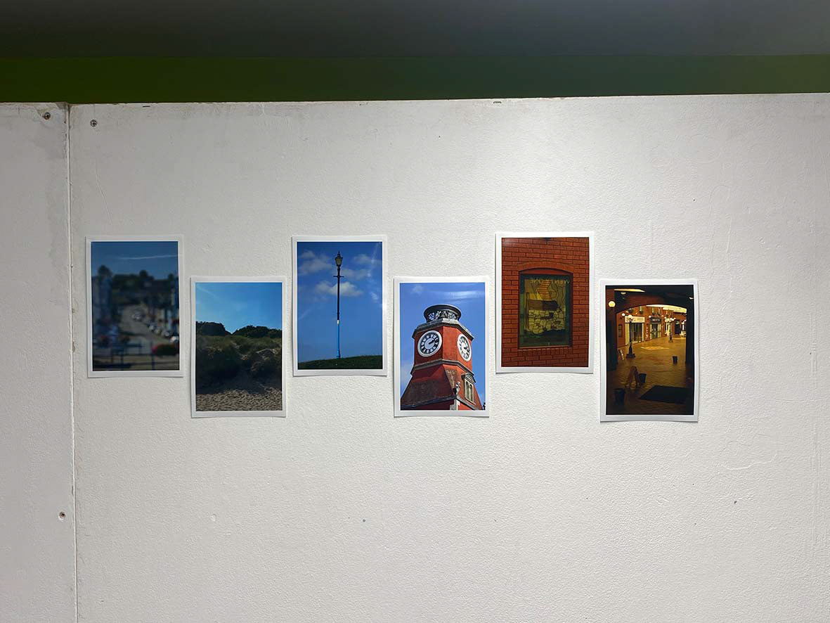
This was our first crit after coming back from the summer holidays where at this point I didn't really have a solid idea, and I was taking quite random images. Looking at these, you can see that the first one is out of focus, the next three all include lots of blue, and the last two are very red/orange - they all differ massively and don't work as a set. Since I didn't have a particularly solid idea, i just chose the images that I liked the best, and sequencing wasn't the top of my list - which it needs to be. This was something that was discussed in the crit by my teacher and my classmates, although they did say there were some strong images in there that didn't necessarily need to be included in a sequence. Personally, I do really like these photos, but as said, they don't work together they work better individually. For me, the one that interested me the most was the first one, which was taken deliberately out of focus - this was my way forward in my mind, something I needed to further explore. I also took this photo as an experiment, not expecting it to turn out too well, however, this led to me wanting to take this certain style forward into a project - shows you need to step out of your comfort zone sometimes and try new things.
To reflect on this, I went away and did some research on photographers who take photos out of focus. I found a photographer called Uta Barth who does this herself, and from looking into her work I was inspired to take more images using this technique. Ultimately, if I hadn't presented my work on the wall and heard that feedback, I most likely wouldn't have discovered this new form of photography - which shows the importance of looking at your work in detail and going away and doing research.
In terms of my layout, I didn't really think about it too much, I just did a generic thing and put them in a way that looked 'neat'. However now I look back, I realise how important it is to lay your photos out with. thought process and meaning behind it. I did think about the colours at least, putting them in order from cooler colours to the warmer ones. This is something I'd like to keep from this - colour scheme - however, my main priority is to get images that work together successfully.


Here is an example of my response to the feedback, and my research on Uta Barth. I thought that I really took a grip on her style, and applied that to my own work really well, capturing the intrusive bokeh and blurry surroundings. Making work like this, which is quite different and contemporary, was really fun to do and a challenge to replicate correctly - however this was only my first shoot or so doing it like this, therefore I still had things to work on.
Crit 2 -

This was the second crit we had, after expectations of a stronger idea forming. At this point, I was still a little unsure, but confident that the out of focus idea would stay strong in my final idea. Therefore, to experiment with it more, I went out on a shoot to a forest on a sunny day - helpful to capture bokeh. In my opinion, I only really liked the out of focus images, especially the top middle one which is almost paint-like. However, the idea of using light creatively was something I wanted to explore more.
Overall, my feedback wasn't very positive, and I took it constructively, as I agreed with the reasons - this shoot was quite spontaneous anyways which isn't something I can be doing in future. The images just look quite bland and don't really take your attention or have much of a meaning behind them - I suppose they were more for the technical elements than anything else. Furthermore, the only positive thing I found with this crit, was the fact that they worked as a set, but I just needed to work on the content of my work and the context behind it.
To reflect on this, I did some research on layouts. I looked at the ways Uta Barth and Sophie Ricketts do this, and used some of my older successful photos to do this.


I really like how these turned out, and felt as though I'd made a step forwards in my critical thinking - finding ways I can present my work successfully. Instead of presenting my work in a random pattern like I had previously, I'll take this research away with me for next time, and make sure my images are the same size too, working better as a set.
Crit 3 -

Here is the third crit we had, and I explored a completely different aesthetic and kind of photography, focusing on specific locations and lighting at night. These were also taken while I was away in Cyprus, where I hoped to create a narrative about my trip, and the difference in their environment to where I usually live, in the UK. However, as I took photos across the week I discovered that my favourite images were those taken at night, therefore I stuck with it for the trip and could eventually create a working set of images to put on the wall. I found that in the UK we are much more developed and modern that Cyprus which was clear from the architecture and cars around. This was really interesting to me with the addition of all the lights, which lit up the streets in a cinematic fashion. The lights were all quite bright and neon which against the older less developed building was very contradicting - which I found to be interesting to capture.
My feedback from these images was positive, and I was told they worked as a set. This was something I needed to work on from the last crit we'd had, where I also wanted to think about my layout. I chose images which were all landscape, and decided to lay them out 4x4 in two rows. Since my idea had developed, and my image content had changed, I didn't think a triptych or diptych would've necessarily worked too well - the reason I lay them out like I did. Furthermore, at this moment in time, I'm more focused on having a book as an outcome, not prints on a wall, or displayed in a gallery setting. Therefore my research and findings will be more focused on books, and book layouts, not gallery layouts.
Crit 4 -

Here is a print of my 'best working image' right now. This crit was about choosing a strong image to print out in A3 to put on the wall. Personally, I edited this image way more than I should've and it showed up on the print - there is noticeable noise/grain which I added a little bit too much of. I only edited it in because I thought the image wasn't very crisp and sharp, so I thought if I added more grain, it would look like it was supposed to be this way. However, I really hate how it turned out.
